Creating a landing page can be hard.
Perhaps you’re not quite sure where to start and you could really need some inspiration.
So we rounded up 24 landing page examples from some of the top companies out there hoping to help you on your journey.
But before we get into sharing these great landing page examples, there’s something we need to clarify – the difference between a landing page and a homepage.
What’s the difference between a landing page and a homepage?
A landing page is a page that has a single goal and is used for directing highly targeted traffic from a marketing campaign (whether it’s email, search, social or any other campaign). Yes, it’s all in the name. It is a page where campaign traffic lands.
A homepage, on the other hand, is an informative page containing links to various other subpages. You can never really know what the visitor of a homepage is looking for, therefore it has to be informative and give answers to the majority of the possible questions.
To read more about the differences between these two, check out our comprehensive guide “Landing Pages Explained”.
Blog post: What Is a Landing Page? [Landing Pages Explained 2021]
That out of the way, let’s get into discovering some of the great landing pages that successful brands use for their digital marketing campaigns.
Landing page examples
I’ve divided examples into click-through landing page examples and lead generation landing pages. Let’s start with click-through landing page examples.
Want to see examples of lead generation landing pages? Jump right there.
Click-through landing pages
What is a click-through landing page?
It’s a landing page without a contact form. It has the same elements as any landing page [link to an article], the only difference is that the leads or sign ups are not being collected on the same page. Its purpose is to introduce your brand and unique value proposition (UVP) before guiding the visitor further into the buyer’s journey.
#1 The New York Times
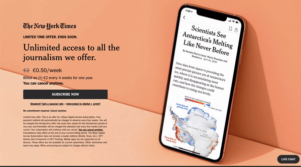
What’s good about this landing page?
- Text “Limited time offer” and “Ends soon” create a sense of urgency to subscribe to The New York Times.
- A succinct and concise offer emphasises unlimited access at a reduced price.
- Price reduction from 2€ to 0.50€ per week is a great way to visually showcase a discount, and also break down the monthly fee into a smaller period, such as a week.
- Orange background that is psychologically connected with excitement and enthusiasm, contrasting text and simplicity of design catches attention.
- The image of a phone with an article about a relevant topic serves as the representation of the offer, showing visitors what they can expect to receive after subscribing.
#2 Amazon Music
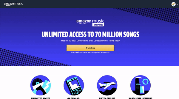
What’s good about this landing page?
- The title communicates Amazon Music’s crystal clear unique selling proposition: “Unlimited access to 70 million songs”.
- Bright purple background is known as intriguing colour as it soothes, but also presents space for mystery and new ideas.
- Yellow call to action button pops on this page’s background and is compelling for the viewer to try the solution for free.
- Clear and minimalist copy with well below 50 words is straight to the point, easy to read and aims to tackle customer’s potential objections.
#3 Pipedrive
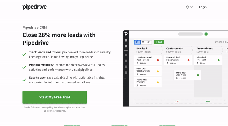
What’s good about this landing page?
- A headline containing stats about the improved performance after using Pipedrive’s tool is intriguing and promising. (Quick reminder: only make promises that you can keep; the worst is to make a promise and not deliver, which will result in losing your precious customer’s trust).
- The bulleted list states benefits for their potential customer instead of features, and bullet points make it easy for the viewers who skim-read (that’s most of us!).
- At the end of the bullet points, there’s an enticing call to action button using the power word “free”.
- The image of Pipedrive’s interface paints a picture of what the viewer can expect after signing up for a free trial.
- Just a bit above the fold, you can see their excellent rating on Trustpilot, which gives trust and confidence that people find their CRM of great value.
#4 Wix
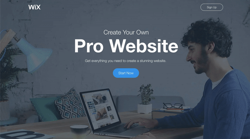
What’s good about this landing page?
- Simplistic and clean design with no navigation bar makes it easy for the viewer to focus and stay engaged with Wix’s offering.
- The imagery aligns well with the brand, showcasing potentially a small business owner creating his website from his cosy space.
- The description highlights clearly why the viewer should start with Wix: “Get everything you need to create a stunning website”.
- The “Everything You Need. And More” section lists the features of the solution and further below includes benefits for the potential customer.
- The “Get Started with a Beautiful Template” section showcases what your website may look like when choosing Wix’s solution.
#5 Hootsuite
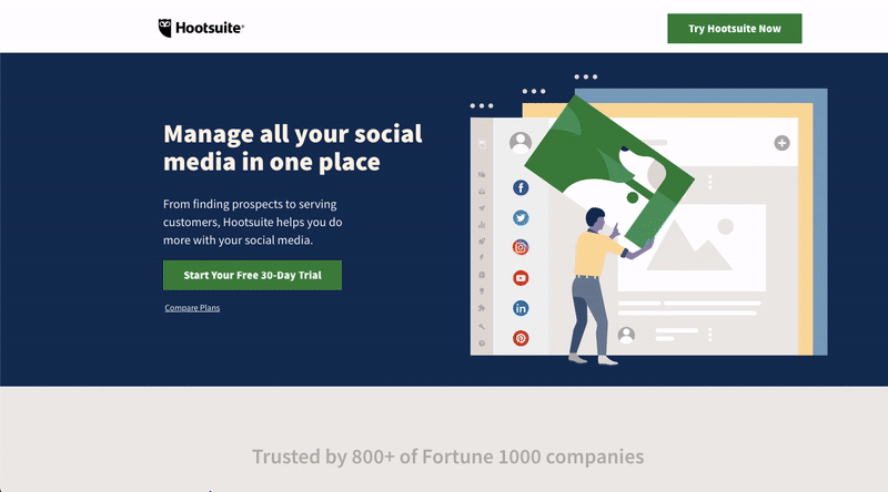
What’s good about this landing page?
- The headline is interesting and clearly states the value for its potential customers, whilst the description is a logical continuation of the headline which is further explaining the benefits.
- The green CTA button contrasts the rest of the page well and the power word “free” makes it compelling.
- The “Trusted by 800+ of Fortune 1000 companies” section and a list of well-known companies builds trust and authority.
- The “Solutions for everyone” section highlights four different pricing plans and explains clearly what each of them entitles, giving the viewer the important information to make an educated decision.
#6 Leadpages
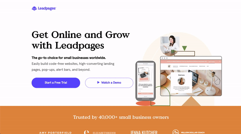
What’s good about this landing page?
- The headline and description define that their target audience is small businesses worldwide and states that their platform helps them to grow their business.
- An attractive image of a page built using their platform showcases how it will work in both desktop and mobile format.
- In addition to adding the number of customers and logos of some recognisable brands, they have gone a step further to display social proof by adding a few quotes and tweets from their customers.
- “Create Your Online Presence”, “Collect Qualified Leads”, and “Grow Your Business” are benefits for the user instead of the product’s features.
- Closer to the bottom of their landing page, they bring out seven reasons why they are different from their competitors (without actually naming any competitors). It’s a great way to, once again, tackle potential customer’s objections and showcase how your platform can help them solve their problems.
#7 LinkedIn

What’s good about this landing page?
- A short and minimalistic copy above the fold is persuing the viewer to get started and create an ad.
- On the second block, you can see three key stats that showcase the benefit of having an advertising account in the world’s largest professional network.
- Below the benefits, you can notice the three-step process of getting started visualised, making it look easy for a potential LinkedIn advertiser.
- They finish off the landing page with a good copy, convincing the viewer to get started: “Create an ad in minutes. All it takes is a LinkedIn account.”
#8 Grammarly
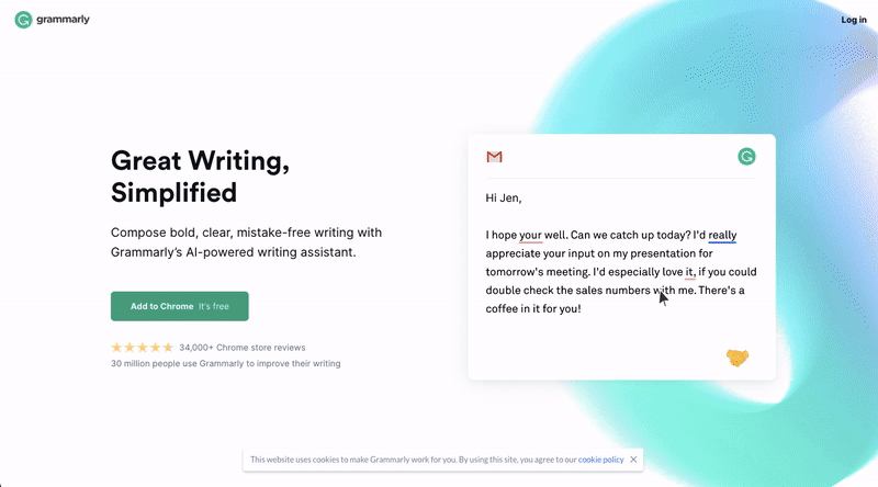
What’s good about this landing page?
- On the right, you can notice a video of Grammarly’s solution in action, which shows the viewer how easy it is to use the product and what its real value is.
- A green CTA button stands out on the white background, tells the viewer exactly what will happen when they click on it, and ensures it’s free.
- Grammarly has placed impressive stats, such as 34,000 reviews and 30 million users, just below the CTA button to entice viewers to click.
- A quote and a list of their client’s logos further below add trust.
- Headlines “Write your reader in mind”, “Works where you do”, and “Anyone can be a great writer” are compelling and speak to their target audience.
#9 QuickBooks
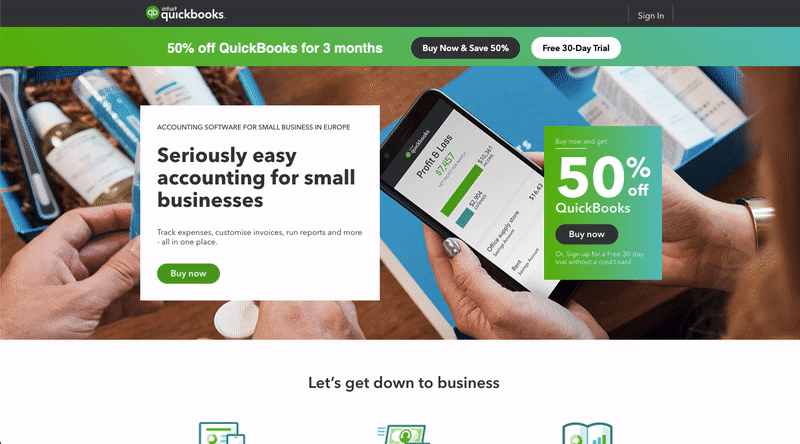
What’s good about this landing page?
- The headline showcases the value of their solution.
- The CTA button “Buy now” and get 50% off for the first three months is an attractive offer and creates a sense of urgency to take action now.
- On the second block, you can notice they are listing the platform’s benefits with a short explanation that small business owners can enjoy.
- The social proof in the form of a number of users and a quote from a fellow small business owner builds trust.
- Three pricing plans for small businesses placed next to one another gives a moment of comparison at a glance.
#10 Square
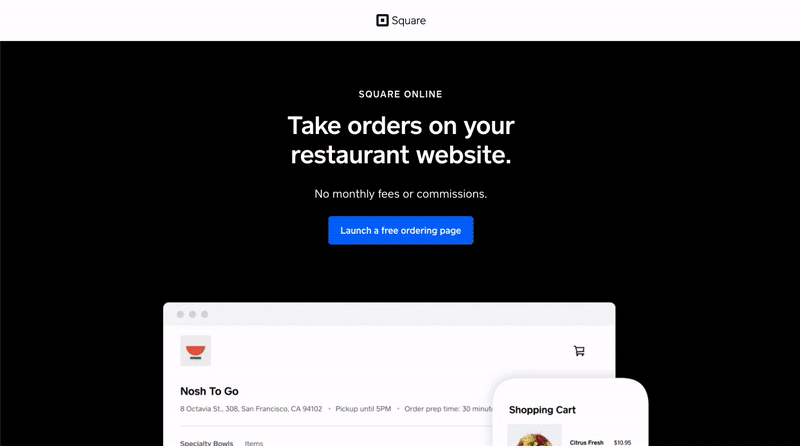
What’s good about this landing page?
- The headline highlights a simple solution for restaurant owners and intrigues them to know more.
- The call to action button is relevant, explaining what happens after clicking on it, and eliminates the objection of the solution’s cost.
- The white imagery contrasts with the black background and showcases the way the platform looks.
- A relevant quote from their existing customer proves the value of their platform.
#11 Calm
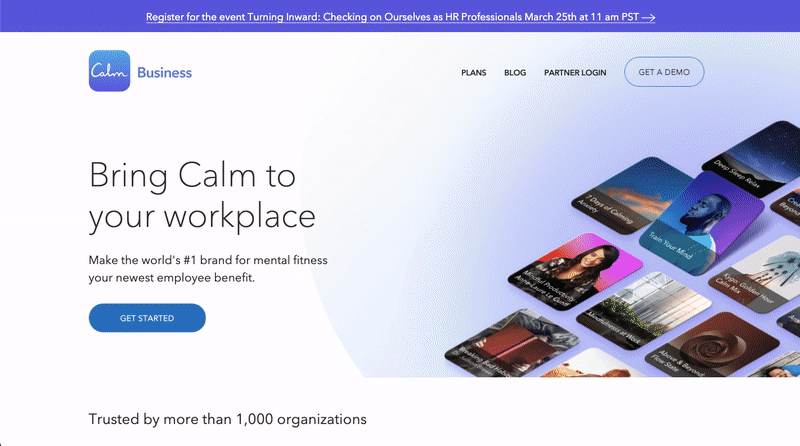
What’s good about this landing page?
- The headline gives value to their target audience and attracts them to know more about the #1 brand for mental fitness.
- Trusted by more than 1,000 organisations showcases that their solution is valued, and large corporations such as Universal and Lincoln are using their app.
- Clear and simplistic design makes the page easy to follow and guides the eye to the most important elements.
- Statement “Build a more resilient organisation” is an attractive title and is explained further on the page.
- Quotes from some of their partners encourage trust in their offering.
#12 MasterClass
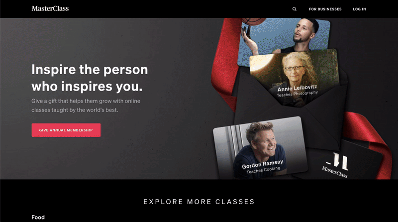
What’s good about this landing page?
- The copy is well written and speaks to its target audience, who are people looking for an inspiring gift for their loved one.
- Classes given by the world’s best show authority and value of their product, in addition to the breadth of their courses ranging from cooking to DJing.
- A clear red CTA button “Give annual membership” contrasts the black background well and is relevant to the offer.
- The quotes of people who have taken the course instil trust.
#13 SemRush
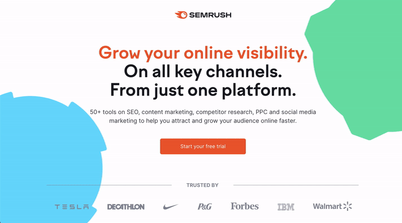
What’s good about this landing page?
- The headline communicates a clear benefit.
- A call to action button pops out due to its orange colour on the white background.
- The logos of well-known brands, stats about the usage of their tools (including awards won), a customer testimonial and the customer rating from three main review platforms all add trust.
- The screenshots of the user interface in the “See what’s inside” section gives a closer look at the tool and the usage possibilities, which is helpful to their target audience.
Lead generation landing pages
What is a lead generation landing page?
Quite like the name suggests, these pages have a lead generation form, and they aim to generate new leads for your business. These are more often used for business-to-business companies (B2B), software as a service (SaaS) businesses and when offering a useful resource such as an ebook in exchange for the viewer’s email address.
#14 Upwork
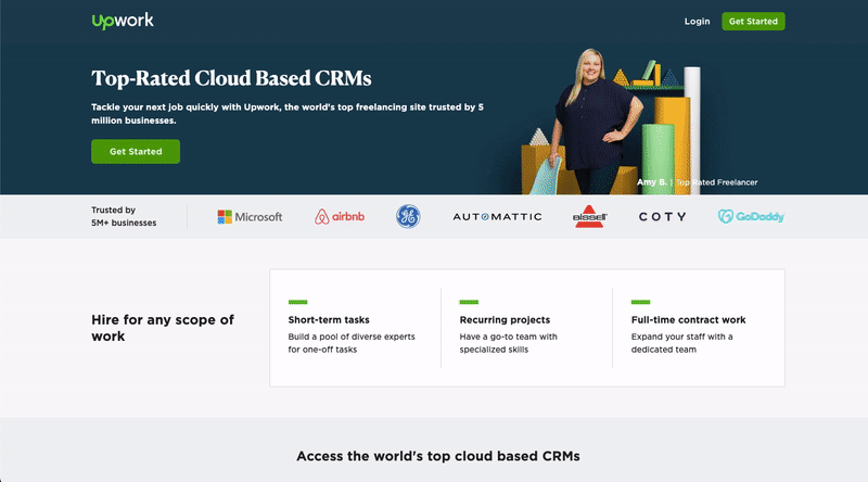
What’s good about this landing page?
- An image of a smiling person who is one of the potentially available freelancers for hire catches attention.
- A description packed with social proof and a row of well-known brand logos add trust.
- They highlight valuable information to their target audience, such as hiring talent for any scope of the work: short-term tasks, recurring projects and full-time contract work.
- The talent hiring process is explained as a simple four-step process that adds value to the employer, i.e. free job posting and freelancers come to you.
- Two-field lead generation form placed at the bottom of the page allows interested potential customers to create an account quickly and start hiring.
#15 VWO
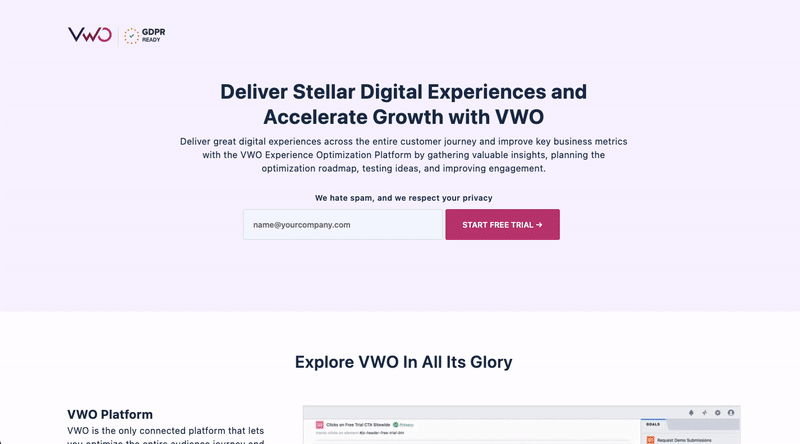
What’s good about this landing page?
- The copy is enticing and showcases how their platform can solve some of the problems their audience may be facing, such as accelerating growth and improving key business metrics.
- A lead capturing form with just one field is easy for their target audience to complete.
- On the second block, next to their software’s features they bring out the real benefit of that particular feature for their audience, i.e. VWO testing – test the experiences without IT help.
- Social proof from Warner Music Group, eBay, Target and others add credibility and GDPR, CCPA and other badges ensure data security.
- Well-written headlines make you want to know more, like explore VWO in all its glory and what makes VWO an obvious choice.
- Customer satisfaction, first response time and first call resolution are attractive support stats that assure their potential customers that their questions will always be answered promptly.
#16 Shopify
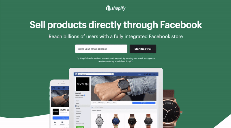
What’s good about this landing page?
- The clear and concise messaging helps to understand at a glance what this page is about.
- One-field contact form above the fold makes getting started easy.
- Below the messaging, there are eye-catching images of Facebook Shop views on desktop and mobile.
- Social proof is presented in the form of customer logos, and an intriguing customer quote stating Shopify is the best solution on the market.
#17 Marketo
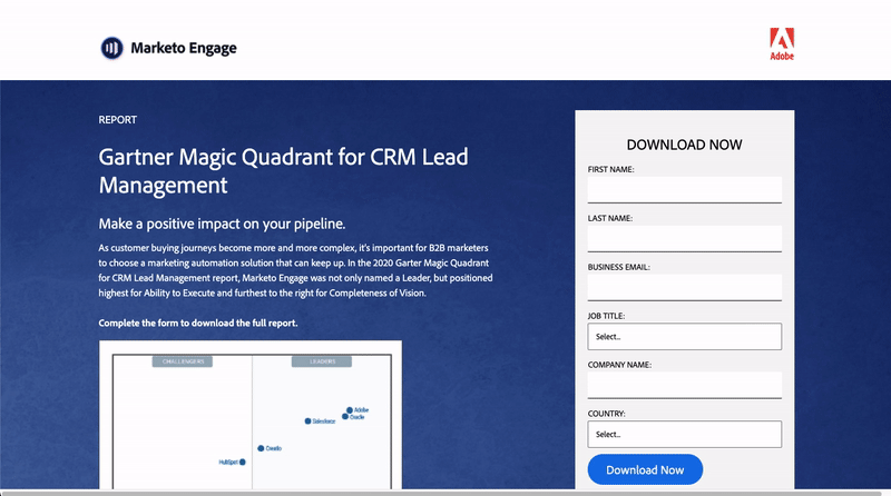
What’s good about this landing page?
- Marketo uses this landing page to showcase a report where their platform is positioned as “the leader”, which essentially showcases how great their platform is, and it’s an indirect way of promoting the software.
- In the contact form, they ask for business email, job title and company name, which helps them qualify their incoming leads.
- The image of a quadrant where their solution is positioned next to its competitors, is intriguing and gives an idea of the offered report.
- The list of a few notable companies who trust Marketo’s solution adds certainty to their offering.
#18 Drift
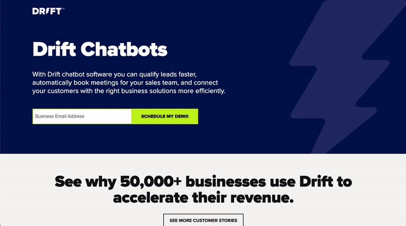
What’s good about this landing page?
- A description gives a good understanding of how Drift Chatbots can be useful for a business: lead qualification, scheduling meetings, customer support.
- A short form (with just one field) above the fold and with a striking neon green colour catches the attention.
- They’ve used compelling social proof in the form of logos of well-known brands and a customer testimonial.
- The copy of the landing page addresses the problems their target audience may be facing.
#19 Zendesk
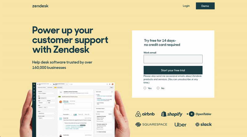
What’s good about this landing page?
- Zendesk is using a short landing page to keep the user attention focused on a clear offer and contact form.
- The yellow background grabs attention and it is psychologically associated with characteristics like energy and warmth.
- The title makes it clear what Zendesk is offering and its highlighted large customer base offers certainty in their solution.
- The image of their user interface gives an idea of what it will look like once one starts a free trial.
- The short form with just one field for email contrasts well on yellow and is super simple to fill out.
#20 Intercom
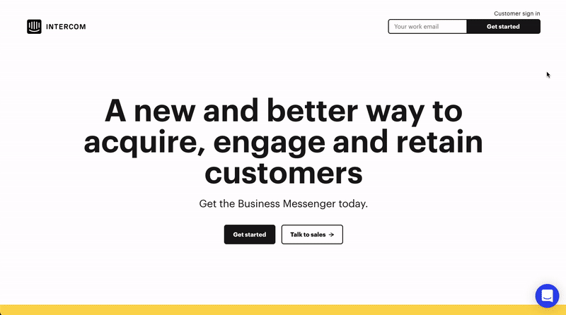
What’s good about this landing page?
- A compelling headline makes the viewer read more.
- The use of bright yellow and neon blue for social proof sections catches the eye.
- The contact form at the bottom of the page with a quote of their customer is an excellent way to ensure quality and trust.
- The arrow next to a form acts as a visual aid, guiding the viewers gaze towards the form.
- One-field form stays on the sticky header when scrolling down, reminding the viewer to fill it.
#21 Enghouse Networks
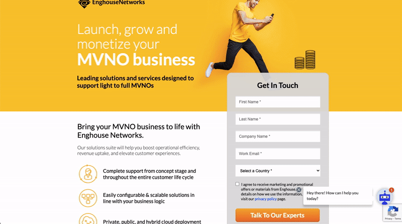
What’s good about this landing page?
- The use of bright and vibrant colour yellow and the image of a joyous man immediately draws attention.
- A chatbot on the lower right corner can be useful: when a person does not find what they are looking for, they may turn to the bot instead of just exiting the page.
- A contact form is fairly short, and the call to action button “Talk to our experts” is calling to be clicked.
- The landing page’s copy talks to Enghouse Networks target audience, includes terms like MVNO that their target group is familiar with and highlights the solution to the problem they may be facing.
#22 Hubspot
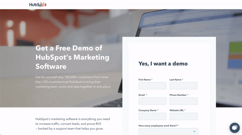
What’s good about this landing page?
- Hubspot’s well-written copy invites you to see for yourself why 100,000+ customers trust Hubspot.
- It’s clear what you get when you fill out the form on the right – free demo from the Hubspot team.
- The design and placement of form fields make it look shorter than it is.
- Further below on the landing page, Hubspot brings out the benefits of their software instead of just listing features.
- A phone number is placed at the bottom for those who want further information.
#23 Paychex
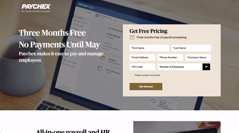
What’s good about this landing page?
- A headline features an attractive offer – there won’t be any payments until May.
- Even though the Paychex form has quite a few fields in the contact form, the design and positioning of the fields (three of them on the same row!) make it look short.
- Paychex is taking advantage of video format to explain the platform and showcase customer testimonials.
- A list of awards they have received shows the trustworthiness of their solution.
#24 Net2phone
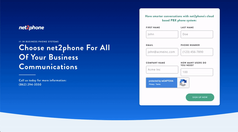
What’s good about this landing page?
- Net2phone has a contact form that a customer can fill out, as well as a contact number below the title to find out more information.
- As social proof, they have included video testimonials of their client, which is a compelling way of showing what your existing customers think of your solution.
- A nice short list of reasons why to choose net2phone communication solution gives a quick overview of the benefits their solution provides.
Conclusion
There you have it, 24 great landing page examples that well-known brands use for their digital marketing campaigns.
I truly hope you find value in my listed examples of great landing pages.
Are you interested in building landing pages that convert?
Contact our digital marketing studio for more information.
1 Comment
Comments are closed.
Hi! This is my first visit to your blog! We are a team of volunteers and starting a new project in a community in the same niche. Your blog provided us useful information to work on. You have done a outstanding job!