Are you looking to find ways to increase the conversion rate of your landing page?
Understanding how to create a high-quality, well-converting landing page is crucial. It helps you to bring in leads and essentially grow your business.
If you’re wondering what is a landing page and why you really need one, then check out our article “Landing Pages Explained” where we answer all of these questions about landing pages.
Creating a landing page that converts takes experimentation but following below landing page best practices gives you a head start.
Best practices for creating a landing page:
- Determine your target audience
- Create a visual hierarchy
- Write clear and compelling copy
- Ask only for the necessary information
- Utilise social proof to your benefit
- Add an irresistible call to action – but only one
- Keep the design simple
- Keep the page load and mobile experience in mind
- Add analytics and tracking
- Test your landing page for improving conversions
- Don’t forget about the thank you page
So let’s get started.
#1 Determine your target audience
The first step, and often the most important one is to become clear about your buyer persona profile. That means crafting a representation of your ideal customer.
Defining your potential customer’s characteristics, problems and needs is crucial. If you don’t know who he or she is, how do you know which tone resonates with them, who to target and where to find them?
Blog post: What Is a Landing Page? [Landing Pages Explained 2021]
In your buyer persona define their:
- Demographic data – How old are they? Where do they live? What is their occupation and yearly income?
- Background – What is their previous work experience and education? Which qualifications do they have? What are their technical abilities and skills?
- Personal characteristics – What is their character like? What are their strengths and weaknesses? Write down their hobbies and what they value in brands they support.
- Goals and fears – What are their goals and fears in life or work that your product/service could potentially help them to solve?
- Negative objectives – What are some of the reasons they wouldn’t use your product or service?
- Channels – Which social media channels are they using? Where do they find new information? Which websites do they use the most? Where are they looking for solutions? What do they insert in search engines to find solutions?
- Tone and language preference – Which language and tone do they use and prefer to hear when speaking to them?
You can give your persona a name and gender to make it more personal (yep, Accounting Annie, Marketing Mary, Sales Sam). The more in-depth you go when describing the above mentioned aspects the better.
To make your persona represent your real customers, try to include your sales team in the discussion since they face the customers day in and day out, or conduct interviews with your current clients.
#2 Create a visual hierarchy
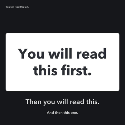
Before the potential lead is ready to fill out the contact form, the visitor will take a look at the whole screen. The elements, their order and design help the viewer to understand where to look next and which action to perform.
Here’s a simple example of how our eyes move and how a good hierarcy of text and design help us to understand what is the most important information. Hence, what we should read first and what last, if at all.
Source: reddit.com
The main landing page elements are:
- Headline – the value of your offer
- Image – a relevant image to your audience
- Description – explanation of the headline with additional benefits
- Lead form – placed above the fold to capture visitors contact information
- Call to action (CTA) – value-oriented and compelling CTA sitting above the fold
Let’s look at how Webflow has created a hierarchy of the main landing page elements.
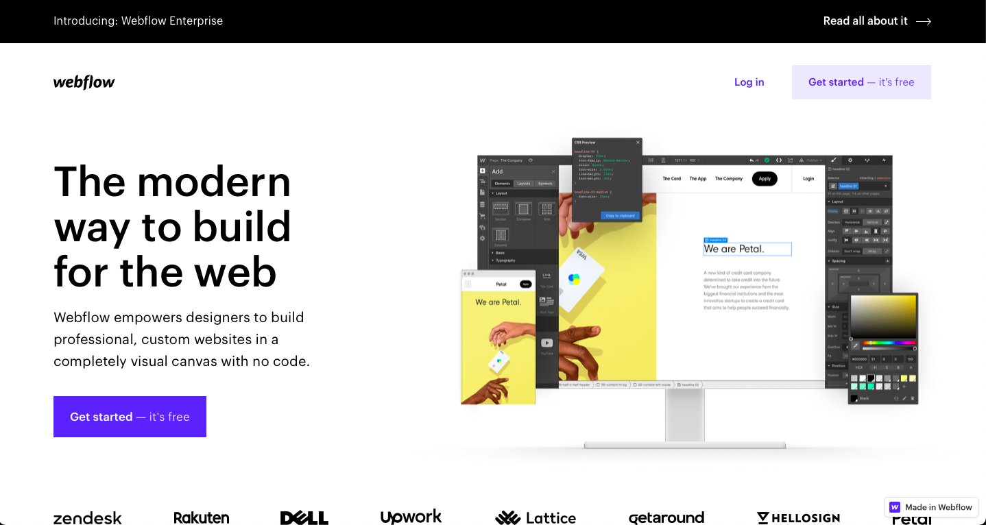
Their headline “The modern way to build for the web” combined with the image on the right of the screen, paint a clear picture that they’re talking about a website builder.
Webflow’s description explains how they empower their main audience aka designers to solve their problem – build beautiful websites without writing code.
Below you can notice a CTA button with a colour that contrasts with the white background. The CTA button states “Get started – it’s free”. Mentioning that using their platform is free is a great way to eliminate their potential customer’s fears.
Notice how Webflow has placed the most important elements above the fold, so the viewer can see that first and based on this information decide whether to scroll further for more details or leave the page.
#3 Write clear and compelling copy
On an average website, only 28% of the words are read (statisticbrain.com).
Think about it for a moment.
Of course, this is an average – there will be sites where visitors read way more and way less. But how can you create a copy that captures attention?
Since you determined your target audience’s main challenges in step one, you can highlight your solution to their problem in your landing page copy.
Step in their shoes and use language that resonates with them. Showcase the benefits of choosing your offer or product/service and how it will help them achieve their goals (not yours).
A headline needs to be as CLEAR as possible. That means short sentences, no jargon nor buzz-words.
If your headline seems compelling to your audience, only then they will read your description, view your call to action and the rest of the copy.
See below an example from Asana, a project management system.
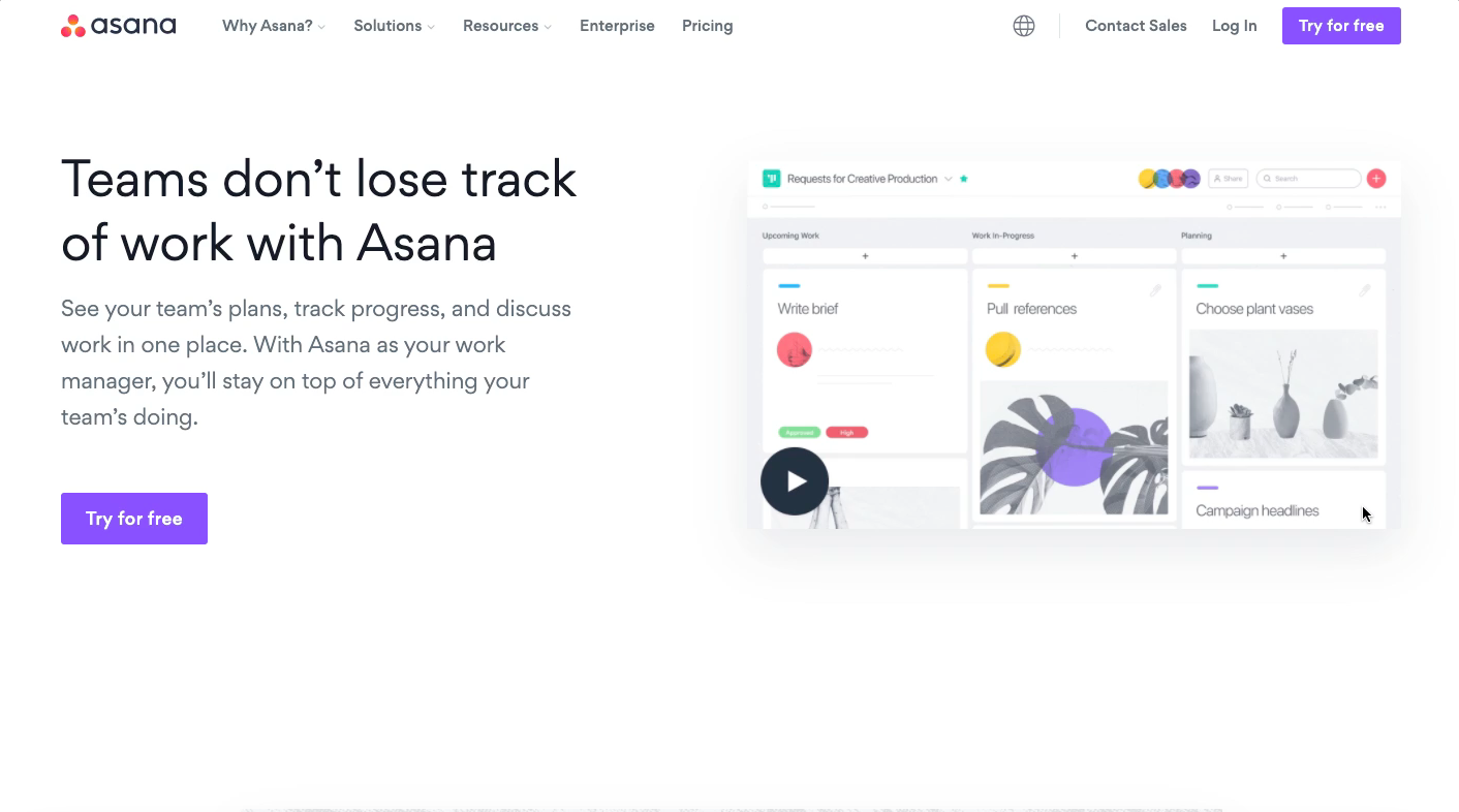
The main headline “Teams don’t lose track of work with Asana” gives a clear message that with their software, I’ll be on top of team management and overall work progress. It’s enticing, showcasing the value of their solution. And most importantly, it intrigues to learn more.
In the description, Asana explains more in detail what the headline means. They bring out other benefits such as seeing the team’s plans, tracking progress and discussing work in one place.
Lastly, there is a clear call to action enticing the reader to try their software for free.
Pro tip: use power words
Power words trigger viewer’s emotional response. They’re the reason we click on ads, sign up for newsletters and purchase products.
They’re excellent at capturing attention and making you intrigued about the solution aka your offer.
To prompt a specific emotion in the reader, use relevant power words in your copy.
Whether you aim to create urgency, security, scarcity or boost reader’s self-perception, you can use specific words.
Here are some of the most effective business power words:
- Urgency – now, bonus, cash, exclusive, final, first, etc.
- Affirmation words – amazing, celebrate, courage, delight, excited, etc.
- Security – anonymous, authentic, best-selling, certified, risk-free, etc.
- Scarcity – final, limited, last chance, hurry, never again, etc.
But bare in mind – less is more. Overusing these words can cause the reader to become uninterested instead of enticed.
#4 Ask only for the necessary information
How many fields should you have on your form? It all depends on your goals.
If your goal is to capture a high number of leads, then add a lead capture form with a minimum amount of fields. That means absolute necessary info to make it easy and quick for the user. Take a hard look at what you actually need from the website visitor and eliminate all fields that don’t provide vital information. That could mean having a form with just two fields, requesting the name and email only.
Alternatively, if your goal is to capture high quality leads, then add more fields that the users need to fill out. This way you can qualify your incoming leads better and deal with only those who are most likely to benefit from your offering. Since you will get fewer people to fill out the form compared to a short form, your incoming leads may be of higher quality.
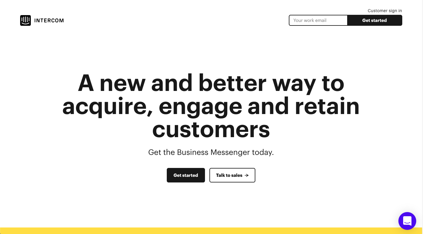
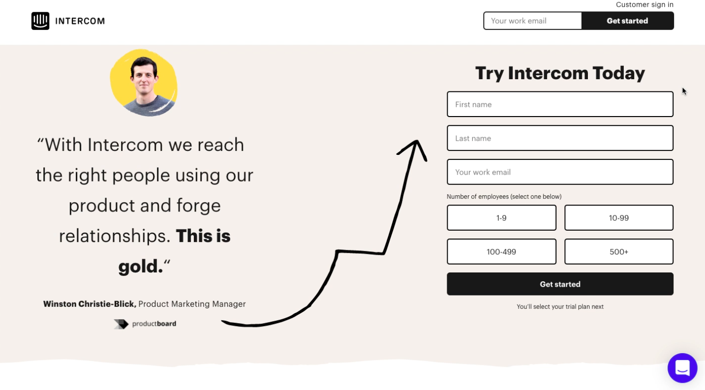
Here’s an example from Intercom.
On the top of the page on the right, you can notice a simple form with just one field, email address, to get started.
When you look at the bottom of the same landing page, you’ll see a slightly longer form with four fields.
#5 Utilise social proof to your benefit
Social proof is a great way to build trust and show your expertise and reliability. Whilst using your client list as a social proof is the most common way, it is not the only one.
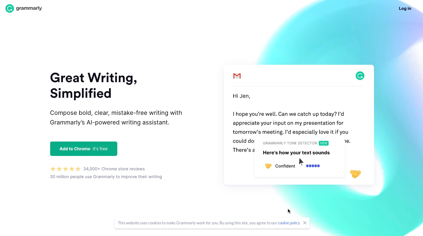
Grammarly is taking showcasing social proof to another level.
Just below the call to action button, you can notice a review from Chrome store and the number of users.
Whilst 34,000 reviews and 30 million users are some impressive stats, notice how Grammarly has placed it just below the CTA button. That can give the user the needed proof to click on the CTA and move down the buyer’s journey.
Some other ways to showcase social proof are:
- media mentions
- trust seals and certifications
- success stories by clients
- endorsement from influencers
- testimonials by industry leaders or other authorities
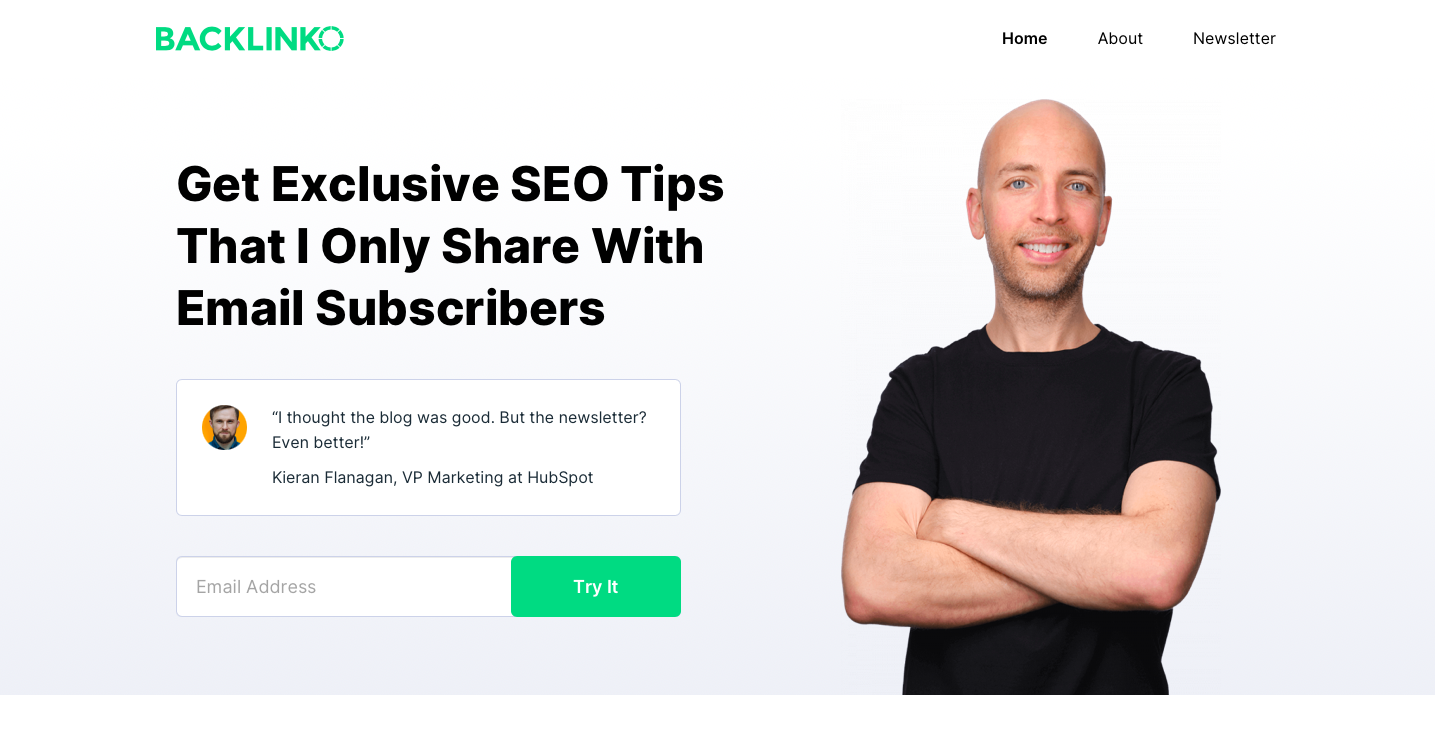
See how Backlinko has used the testimonial from one of the industry leading experts to prove that their newsletter is packed with nothing less but high value.
#6 Add an irresistible call to action – but only one
Call to action is the one and only action you want visitors to perform on your landing page.
Use contrasting colours, so it pops out from the page and catches the viewer’s attention. Ideally, add it above the fold for maximum visibility.
You want to make sure your CTA is clear, compelling and gives an idea of what happens next after clicking on that button.
Get creative with your CTA button text.
Whilst you can often see buttons like “Click Here”, “Continue” and “Learn More”, don’t be afraid to experiment with more value-oriented button texts, such as “Grow My Business”, “Try it for free” or “Start My Free Trial”.
Here’s an example of Tidal’s landing page where they use CTA “Start Free Trial”.
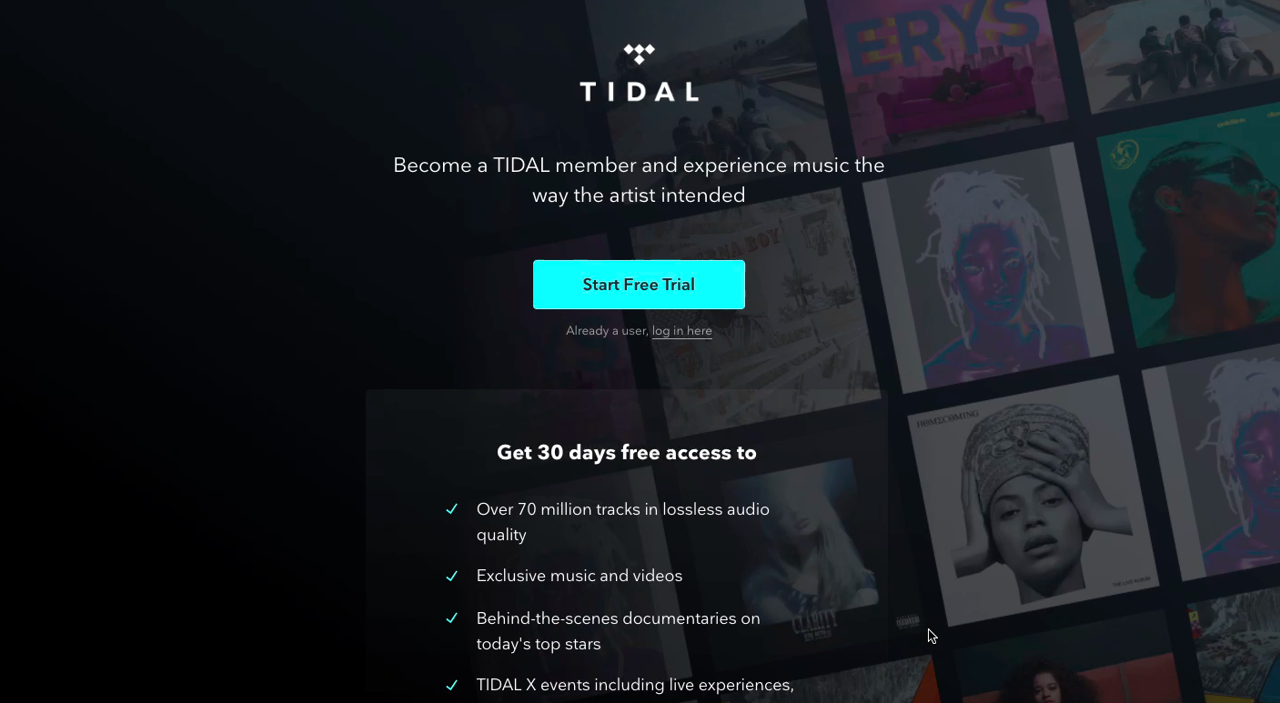
Example of Tidal’s CTA “Start Free Trial”
#7 Keep the design simple
The landing page should definitely speak the language of your brand, but simplify it.
Be critical about every element and remove anything that doesn’t support the viewer to perform the aimed action.
Whilst we’re all in for using unique animations and flashing pop-ups prompting a visitor to sign up for a newsletter, they may not benefit your landing page (unless the goal of your landing page is to get newsletter sign ups).
When it comes to your website, a navigation bar is extremely useful because you can never really know what the visitor is looking for. But landing page visitors are targeted traffic looking for a specific offer. In this context, navigation is a distraction and removing it leads to better results.
A good example of a simple design is the below landing page by Wix, a website building platform.
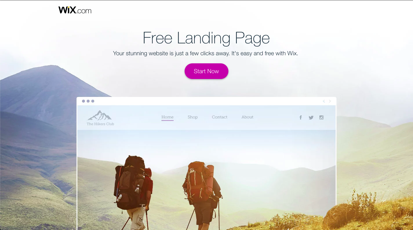
Their background image is a representation of a website you could potentially build with their tool.
The CTA button is popping out due to the bright colour that contrasts with the background.
Also, you can notice how they use short copy but convey the value and benefits.
#8 Keep the page load and mobile experience in mind
Fast page load may seem obvious in the age of technology and mobile devices. But it’s unbelievable how often we still stumble upon a site that takes “ages” to load.
When a potential lead comes to your site, and it takes too long to display the full content of a page, they won’t sit around and wait for it. Instead, they just leave the page. And that’s potentially a lost lead for you.
To prevent this from happening test your landing page’s load time and see what is the mobile experience like on a real phone. Yes, that means visiting your landing page with at least one iOS and one Android device.
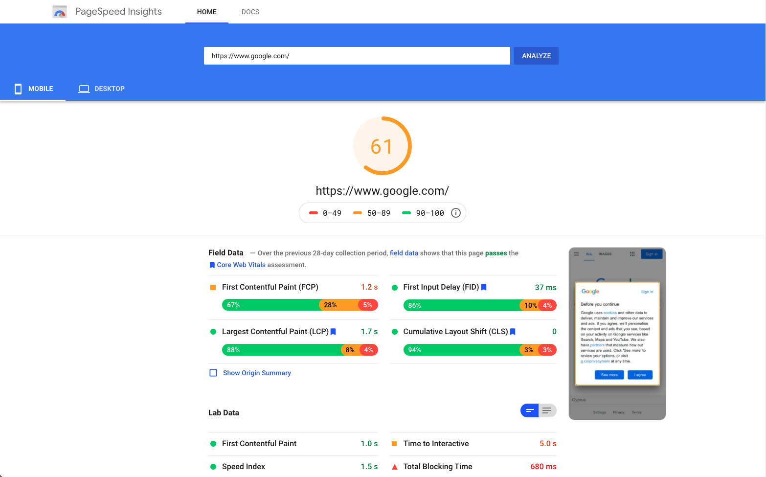
To test your page load on mobile and desktop, you can use Google’s free tool PageSpeed Insights.
Just enter your landing page’s URL in the field, and you’ll see a general score and suggestions for improving your mobile and desktop speed score.
Another way to decrease site speed and create a flawless experience for your mobile users is by using accelerated mobile page or AMP for short. AMP is an open-source HTML framework optimised for mobile web browsing and is intended to help webpages load faster.
#9 Add analytics and tracking
After you’ve used all of the landing page best practices, you have yet one crucial aspect missing.
That’s setting up analytics and tracking.
Some landing page builders provide you with good analytics and heatmap, from which you can see:
- where your visitors click
- where they move with their mouses
- how far they scroll
If not, you can easily set up free tools such as Hotjar to see heatmap and Google Analytics to see analytics, conversions and what actions the landing page visitors are taking.
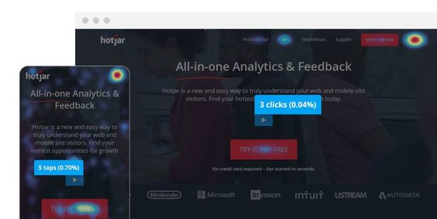
Example of Hotjar’s click map showing where people click
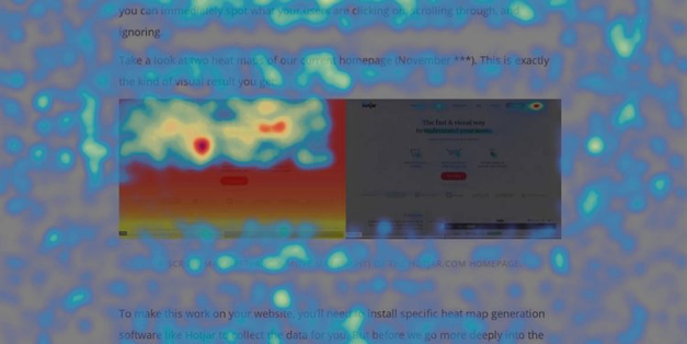
Hotjar’s move map showing where people move with their
#10 Test your landing page for improving conversions
Like we mentioned at the beginning of this article, building a landing page that converts well, takes experimentation and testing.
That means, once your page is ready and published for a campaign, you cannot just sit and hope for the conversions to appear.
It takes consistent A/B testing of elements to find version that brings the best results.
What can you test on your landing page? The short answer is almost anything.
Some of the examples include (but not limited to):
- Copy – anything from headline to descriptive text
- CTA button – from button colour to text of the button, but also how many CTA buttons you have on the site and their placement on the page
- Background image or colour – an image type i.e. an image of people smiling vs an image of people with their backs towards a camera, or image vs illustrations.
- Placement of different sections – Let’s say the current structure of your landing page is: the main block, benefits, social proof and a form. You can create a version B of your site with a different structure: main block, social proof, benefits and form.
- Navigation bar and no navigation bar – Whilst we suggest (for a reason) as a standard practice to avoid the navigation bar on your landing pages, you can add it and test the conversion rate with and without it.
Let’s look at an example from Spotify, an online music streaming platform. They are testing two different copy versions.
One of the landing pages has the headline “Listen without limits” and the other one “Go Premium. Be happy.”. In addition to the different headlines, they also have different descriptions.
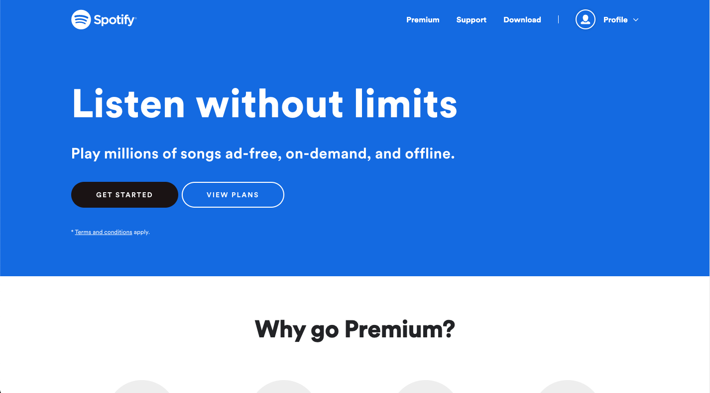
Shopify landing page version 1
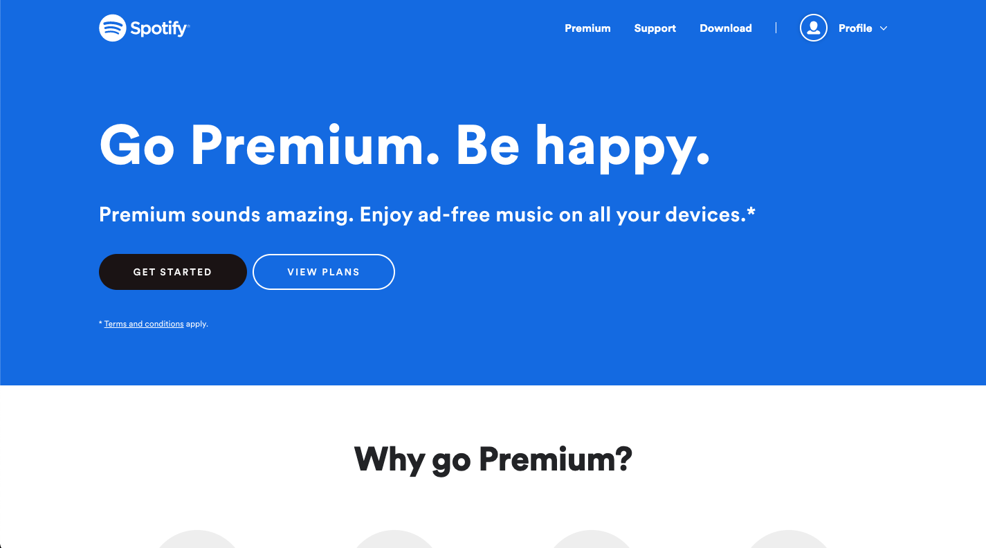
Shopify landing page version 2
#11 Don’t forget about the thank you page
You worked hard and got a lead. That’s great, but what now?
That’s where a thank you page comes to play.
Thank you page is a page where your lead will be directed after completing a form on your landing page.
On your post-click page should you say “thank you for contacting us” and leave it? If you do, that’s the end of the conversation. Instead, you can thank your lead AND engage them in your post-conversion strategy.
That could mean having a new call to action on your thank you page. The CTA can be anything from inviting to sign up for an upcoming webinar to sending them to a relevant blog post.
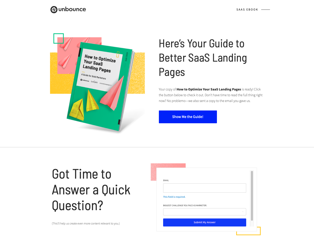
Let’s look at an example to illustrate this.
Unbounce has utilised their thank you page to ask a question that helps them to create more relevant content for their target audience.
Conclusion
By following these 11 landing page best practices you can start your journey of building a high-converting landing page.
Don’t forget to optimise your page and A/B test elements to keep improving your existing version to keep the conversion rate high.
If you need a hand with building a high-quality landing page for your next marketing campaign, drop us an email, we can surely help you.
