After building and optimizing hundreds of landing pages, I’ve noticed that one of the key areas where companies need help is auditing and improving landing pages.
But… how? How to audit your landing page? What to check? How will you know what to improve?
This is what we’ll cover in this article. So, open your landing page and follow these steps and questions as you read.
Are you new to landing pages? Take a quick crash course by learning all the basics about landing pages.
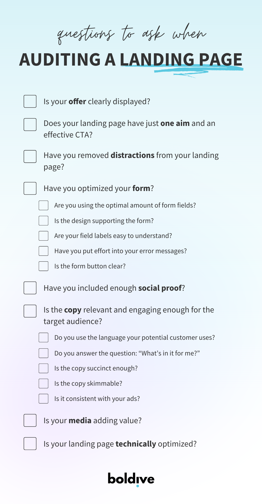
8 questions to ask when auditing your landing page:
- Is your offer clearly displayed?
- Does your landing page have just one aim and an effective CTA?
- Have you removed distractions from your landing page?
- Have you optimized your form?
- Have you included enough social proof?
- Is the copy relevant and engaging enough for the target audience?
- Is your media adding value?
- Is your landing page technically optimized?
So, let’s dig in.
#1 Is your offer clearly displayed?
For your landing page to be effective, you must solve a problem that your customers are facing. And then, you need to communicate it in a way that is easy to understand for your target audience.
1️⃣ Market research
Is your offer relevant and something your audience needs?
A great way to understand your ideal customer better and find out their pain points, is to ask for input from your sales team or conduct customer interviews.
2️⃣ Value proposition
Value proposition includes a clear headline and descriptive copy about what the visitor will get after providing their information.
Is it written clearly, and is it understandable? Or is it a bit too ambiguous?
Also, consider the supporting images – are the used visuals or videos supporting that offer or somehow contradicting or confusing?
3️⃣ 5-second test
Have you ever heard of a 5-second test? It’s a form of a usability test that allows you to understand how clear your landing page and offer are. After looking at the landing page for only 5 seconds, the viewer tries to answer the following questions:
- What is this landing page about?
- What can you do on this landing page?
- What do you remember most vividly?
The point is – if those visitors can’t tell what your landing page is about in the first 5 seconds, you don’t stand a chance of getting them to convert.
You can start using this 5-second test on your colleagues but for the most accurate information, use it on your target audience.
#2 Does your landing page have just one aim and an effective CTA?
As we covered in the back-to-basics article about landing pages, the term landing page refers to a web page that has a single point of focus.
I often see how businesses refer to their pages with multiple call-to-actions and loads of information as landing pages.
It may be tempting to ask the viewer to sign up for a free trial and request a consultation with the expert.
But if you want viewers to convert (which I’m sure you do since you’re reading this article), keep things simple and effective by having one aim. So, no killing two birds with one stone this time. 😅
A landing page is always supported by a strong call to action.
Don’t be afraid to be creative when it comes to call-to-action buttons (CTA).
You may have encountered buttons that say “Submit”, “Download”, or “Buy”. No doubt that these are accurate, but they lack creativity and come across as uninspiring.
Instead, check if you are using more engaging and ‘out of the box’ CTA buttons? Examples include “Start my free trial”, “Save 20% on your subscription”, or “Schedule my demo”.
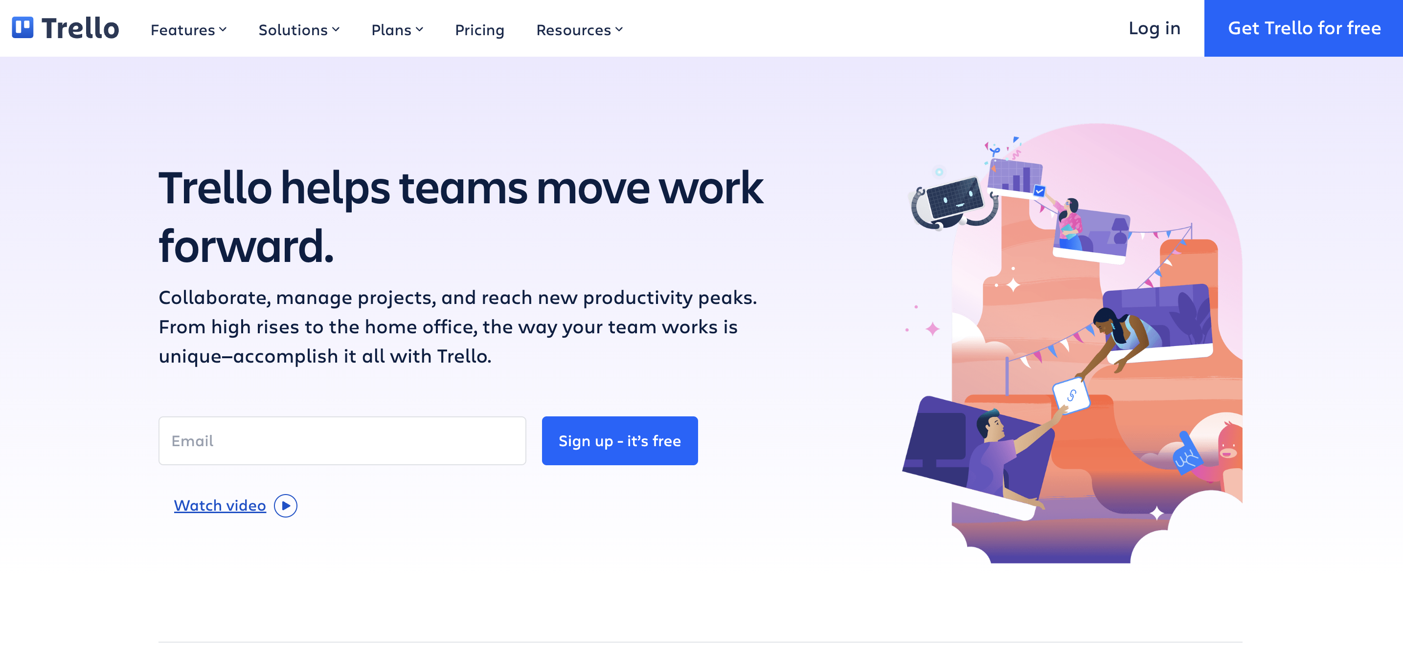
Example of a Trello call-to-action button “Sign up – it’s free”
#3 Have you removed distractions from your landing page?
Now that you have ensured that your landing page has just a single focus and aim, it’s time to check if other elements on that page support that.
If your goal is to get ebook downloads in return for a potential customer’s contact details, do you need to have a footer with links to all the main subpages or include a section about us?
In this context, it’s distracting and takes the focus off the ebook you are trying to promote. For sure, there may be a context when it’s necessary and supports the potential customer in converting.
The general best practice is to remove the website menu bar and footer with all the links. These elements are necessary for the homepage but distracting for a landing page.
In addition, question all the other sections of your landing page. If you can’t find a good enough reason for how a particular element is supporting the main goal then it’s time to ditch it. This, in return, keeps your landing page short, neat, and straight to the point.
#4 Have you optimized your form?
The form is one of the key elements of your landing page. Quite often, they are one of the biggest barriers to conversions.
When it comes to landing page forms, consider:
1️⃣ Are you using the optimal amount of form fields?
Ask too much information or the wrong kind of information, and you’ll scare your visitors off. Ask too little, and you won’t learn enough about the visitor to nurture the lead further. Think about your offer and find an optimal amount of fields that would be a win-win situation for both parties.
2️⃣ Is the design supporting the form?
For example, if you have concluded from your research that filling eight fields is what you must ask from any lead, you can try multi-step forms. That means the viewer is asked one question at a time, often not knowing how many questions will be in total.
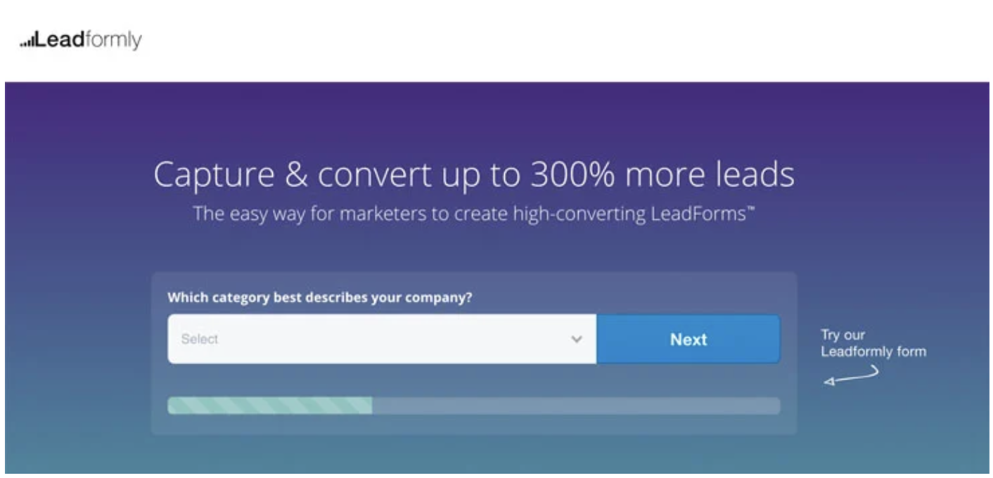
Example of Leadformly multi-step form
3️⃣ Are your field labels easy to understand?
First of all, are they legible? If so, is it clear to the visitor what is asked? Any ambiguity here can make the viewer exit the page real quick.
4️⃣ Have you put effort into your error messages?
It may seem unimportant, but if a form submission try is not going through and the error message is not helpful enough, guess what? You’ll probably lose someone quite interested in your offering.
5️⃣ Is the form button clear?
You have gotten the landing page visitor that far that they are interested in filling out the form. Make sure that the button text is clear, and there won’t be any room for confusion.
#5 Have you included enough social proof?
No matter your offer, landing pages must build trust with your potential customers, or they won’t convert.
Your offer is your promise.
Consider this: how can you affirm to visitors that you can deliver your promise?
That can be including customer testimonials, logos of well-known companies you have worked with, badges of certification, trust seals, number of downloads or customers, and others.
#6 Is the copy relevant and engaging enough for the target audience?
1️⃣ Do you use the language your potential customer uses?
To persuade the viewer, you need to, literally, speak the same language.
One of the best ways is to conduct keyword research to find out the words and phrases your potential customers use in their searches. And then create a copy around them.
This benefits your Search Engine Optimization (SEO) pursuits as it allows your landing page to come up in search engines for relevant keywords.
One great and free keyword research tool is Google Keyword Planner.
Of course, be aware of keyword stuffing ❌, as it’s considered web spam and could harm ranking your landing page on the search engines. Google announced in August 2022 with their people-first content announcement that they are making an effort to ensure people see helpful content written by people, for people, in search results.
2️⃣ Do you answer the question: “What’s in it for me?”
The hard truth is that the viewer will only care about what they get out of it. Ensure that your copy is customer-oriented and that the value for your potential lead or customer is clear and comes out immediately.
3️⃣ Is the copy succinct enough?
Keep it short and simple. You don’t want to bombard your viewers with information that is not crucial for their decision of filling out the form or not. A straight-to-the-point but necessary information will ensure your page is short enough not to overwhelm a first-time visitor.
4️⃣ Is the copy skimmable?
Hello, all skim readers (perhaps you’re one of them?) 👋 If they can’t quickly understand the offer without reading the copy word-for-word, it’s a no-go.
Check if you are using short paragraphs, bullet points, highlighting words or phrases with bold, italic, or colorful font, and visuals.
5️⃣ Is it consistent with your ads?
Another thing to look for is the consistency of your message. If the visitors click on an ad that promised X but on the landing page there is nothing mentioned about the X, they will bounce.
This is also important for trust building: you got their interest with the ad, and they landed on the landing page. Now is your chance to further persuade the reader, provide more information and convert them.
#7 Is your media adding value?
From images to graphs to videos, they all need to add value and support the main aim or goal of the landing page.
Do you use the right type of media to go with your offer?
Different media help to communicate messages in different ways.
If you’re offering something that’s brand new to your visitors, such as a free trial, an explainer video can quickly help them grasp the concepts and give an idea of what the software looks like.
Screenshots assist in getting across how apps are easy to navigate.
Photos and illustrations can assist in connecting positive emotions with your offer, and infographics help explain how your product compares to what else is on the market.
#8 Is your landing page technically optimized?
1️⃣ Mobile view
It seems to be a no-brainer in 2022. 🧠 As the mobile views keep soaring, you need to ensure your landing page is responsive on different devices.
Take a look at your landing page on the phone and tablet, and ask yourself:
- Is everything displayed as it is supposed to?
- Is the text readable?
- Are the images and other media clear and visible?
- Is everything properly aligned?
2️⃣ Load time
What about load time? How long does it take for your landing page to load after clicking?
People want what they are looking for fast.
Did you know that website conversion rates drop by an average of 4.42% with each additional second of load time (between seconds 0-5)? (Portent)
So, a landing page that takes ages to load (and I mean here a few seconds) is a real turnoff for your customers and will make them leave your landing page quickly, frustrated.
What affects the load time?
While I can write an article about all the parameters playing a role, it can get quite technical. Here are some initial things to check with your web developer:
Size of files. Minimize the size of all the files, images, videos, and graphics. I like to use TinyPNG for compressing images.
Hosting. A high-availability web hosting plan supports your landing page in quick loading.
Code. Be aware of any excess and unnecessary code, plugins, and tracking scripts. Also, minify any CSS, JavaScript, and HTML.
Redirections. Redirects increase serving speed, so you’re better off reducing redirects.
______________
That’s it! I hope you found this guide to auditing landing pages useful. If you found out that your landing pages are not 100% perfectly created, look at it as an opportunity to improve your results by following these landing page best practices.
If you have any comments or questions about the landing page audit, reach out via LinkedIn or contact form.